SPACING UI
Bring your own styles.
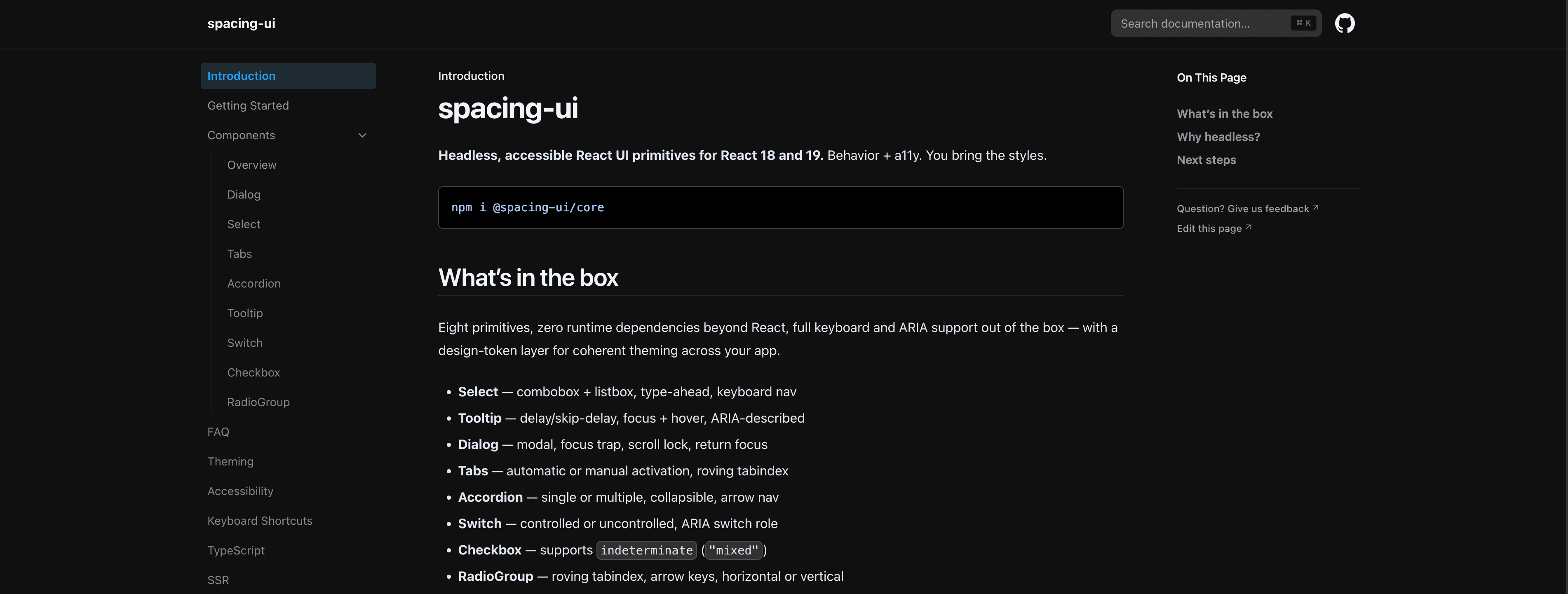
Overview
Select, Tooltip, Switch, Checkbox, RadioGroup, Tabs, Accordion, Dialog, Popover and Progress — a listbox with real keyboard semantics, a dialog that traps focus, tabs with both manual and automatic activation. Every one ships unstyled, so the behaviour is the library and the appearance is yours.
The problem
Teams rebuild the same accessible primitives with inconsistent keyboard and focus behavior, then restyle them again for every product.
Wins
Published as @spacing-ui/core with React 18 or 19 as a peer dependency, built with tsup and tested with Vitest.
Tech stack
TypeScript / React 19 / tsup / Vitest / pnpm